Case Study In Calligraphy
A Potential Namae for my font is Abato
Name
Namae creates a bridge between traditional and modern methods that often clash on a daily basis.
Namae is the Japanese word for Name. The reason for naming it as Namae is due to the case study of Calligraphy being presented. In an attempt to bridge the experiences of American Culture and the influences from Asian Culture, learning Calligraphy and creating Namae would be the first breakthrough in this process.
Concept
Back in December 2020, I was bored from what is called "Winter Break". I was browsing through some design books I had and came across one with Calligraphic Writing. I remember back then that my father wanted me to learn it from him, however I refused. I then asked my father to bring me the kit, and then I started to learn on my own.
While learning, I was thinking of practical uses for the upcoming skills I might attain. One of them was an idea of creating a font that is exclusive for my brand. The idea is that I write the English Alphabet in Chinese Calligraphic style. In doing so, I hope to create a bridge between American and Chinese culture by making this font, which started my journey to create Abato.

I only spent a month and a half when I attempted my first time constructing the alphabet, therefore it is going to look ugly from here.
Progression


Essentially this is the entire view of the Alphabet I created for Abato.
A lot of inconsistency and balance between letters. Sure there were some that were okay, however the important aspect of creating a Font is Consistency. Because I lack the technique, I lack the consistency, therefore this version is a bust, however I was able to extract a few letters to implement it into my design.
Therefore I went back to draw a little more calligraphy and came up with the following letters.


These were the mockups I drew for the word Arubaito and then I went to PhotoShop to process the letters from paper to digital.
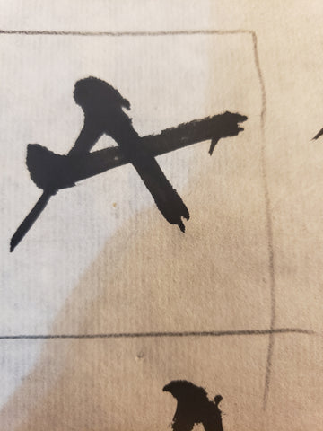
On Digital it was quite different to deal with. The first issue is that some of the black ink would blend with the paper I used, therefore created this "scratchy" look to the overall product. For example, if I use the letter A and process it, it will look like this

You can see that it technically looks clean, however the edges on the letter is way too rough and random, therefore I have to tone it down to make it easier to look at in the final product.

With this rendered design, there is two noticeable differences. One is the color is a single black color. The other is that it is more smoothed out, but retains the unique attributes of the original art. By keeping these "mistakes", it gives the letter a personality, rather than going with a boring look through fixed calculations.
Eventually I decided to go create a "Box" which will contain the letters

However, the box proves to create problems that need to be addressed.
In a small space, how will the letters fit? There is no way I can fit 7 letters in that amount of space without making it look awkward.
Therefore I looked for examples on the web of how they handle these type of things.
Eventually I went through one of the books I bought from Japan and found something interesting.

Between the wall of text, there is this "Corner System" going on and that expanded my methods of handling the "box" design.
Therefore after major adjustments and putting the letters together, I created this sort of "Wall-Scroll" design

This was intended as the back design for the shirt because it is so tall. And to be honest I wanted to end it there, however that proved to be in vain when it came to advertising this product.
Execution
There exist shirts that have an Back-Only design. However, the issue is that when you are showcasing the product, it will not look good for models to wear.
Therefore I had to come up with a design in the front that is tactile, but effective.
I attempted to write the letters アルバイト however the amount of "White Space" created makes the design look shabby.

For example, although I rendered the words, the amount of white space created is simply too much and it wouldn't be an effective approach.
Therefore I thought about Negative Space and decided to make my approach there.

By utilizing various sizes of a singular triangle, I was able to achieve somewhat of a resemblance to アルバイト, and afterwards I created another Box to keep them within a space.

By maintaining the imperfection of the border, I want to convey this clash between traditional methods and modern interpretation.
With this, the design is able to create some sort of Co-inhabitance between the two, thus leaving the front design for the shirt.
Overall Namae was a journey that I never knew existed. From what I thought was completed since March, I had to reexplore the design to add the flair it deserved.
With a name like Namae, there is no one in Earth who would forget such a title.


